“A nobel prize is waiting for the one who visualizes the economy of information” (Steward Brand, The Media Lab)
One of my current travelling companions is “The Media Lab – Inventing the Future at MIT” by Steward Brand. Like several other books about the history of computing in the 80s, this one is also fascinating and it shows again how much ahead of their time were people in those years… and how we are still reaping the ideas that they saw. The book reports on an anecdote by Harlan Cleveland :
“I have wanted for some time to find a map of information flows around the world. The other day I had one hour to kill between appointments in new york city, so I dropped into the Rand-McNally shop to ask for such a map. My request created quite a stir, and virtually every employee was called into consultation. They brought out all sorts of maps showing flows of food and feedgrains, oil and coal, weapons and manufacturers – but finally admitted that they had no map of information flows and didn’t think their competitors had one either.” (Steward Brand, Inventing the Future at MIT, pp. 245)
Can we make a map of information flow in the world today?
Yes we can! In the article that we will present at SSE in Saint Petersburg this summer we show how can we do it for software engineering based on StackOverflow data.
StackOverflow is the principal website for software engineers in search for answers to programming questions. The quality of the answers and the fact that the mean time to a question being answered is 11 minutes make it the de facto market for information regarding programming.
In the StackOverflow information market the currency is reputation points. The reputation points are offered by the user originating a question to the one that best answers it. Others who found the answer useful can provide further points by upvoting the answer later.
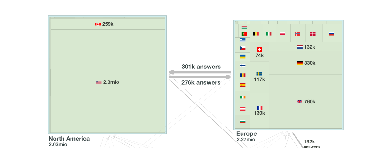
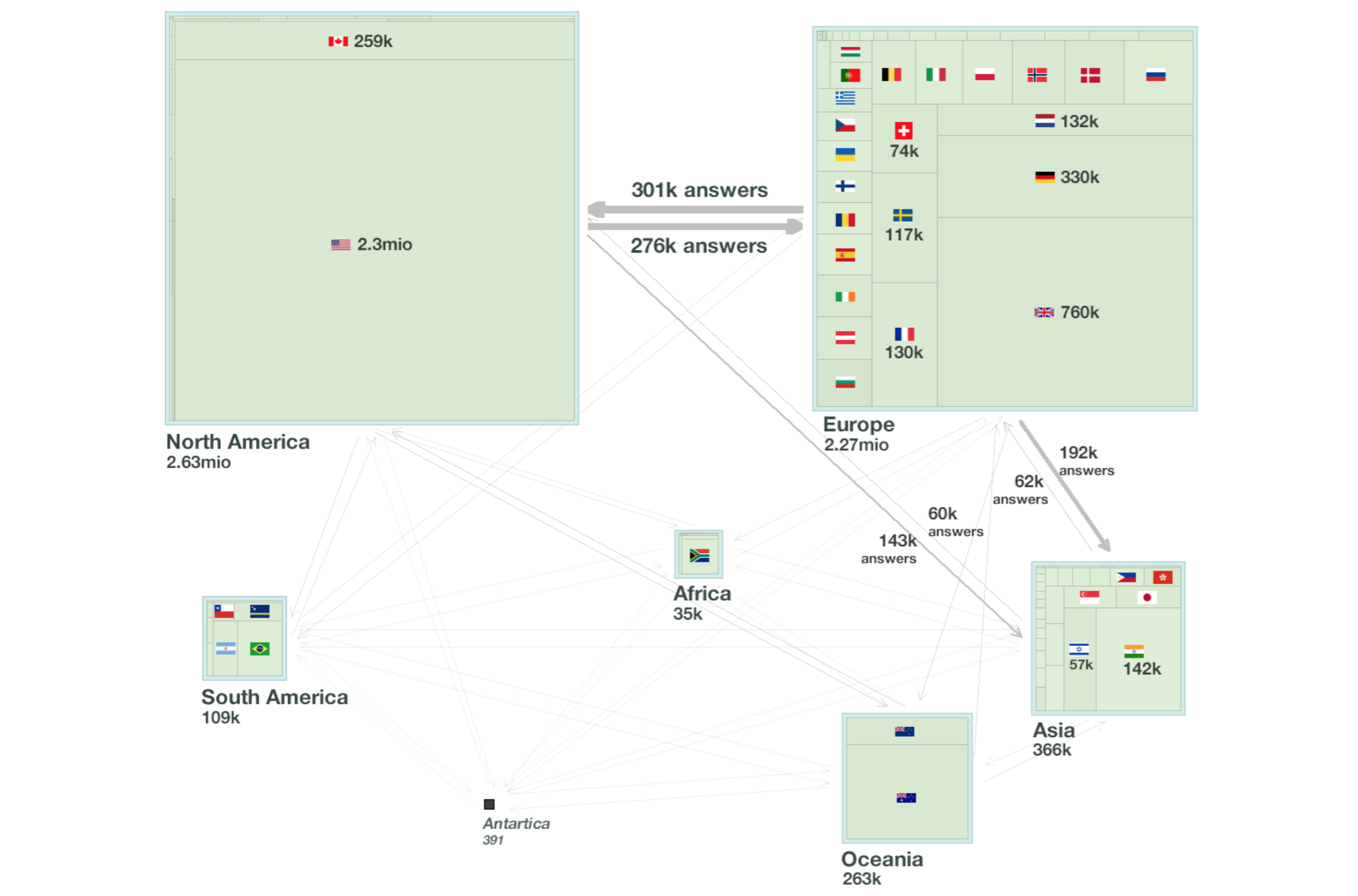
As data source for our map we use ten million questions and answers (published as a database dump by A. Bacchelli at U. Lugano). Among other things the data source contains also geolocation information for a large percentage of the the users. Thus, if we aggregate the exchanges of information to geographical regions we will obtain a map.
How to visualize the map?
Inspired from our earlier work on visualizing software we used the following conventions for visualizing our information map:
- The areas of countries and continents is proportional to the reputation of their users
- The thickness of an arrow indicating information flow (answers) between regions is proportional to the number of answers abstracted in it
- Where we had sufficient space, we labelled countries with their corresponding flags
This map of software engineering information flow in the paper looks like the figure below:
What can we learn?
The most straightforward observations based on this map are:
- EU is exporting more answers to the US than the other way around!
- However, US has more reputation than EU
- Several small countries like Switzerland or Netherland have disproportionately high reputation with respect to their population
- China is practically absent even if Joel Spolsky (the founder of SO) reports large numbers of visitors to the site from there
- Africa does not contribute much
What next?
The map is taken from our paper (pdf, Bibtex) which contains more details about the data collection and analysis (including details on geo-locating users, and the evolution over time of the data).
Is the map representative of the way programming information is spread around the world? Are there other similar maps that you are aware of?
If you want to talk more about this topic let me know.
Possible Student Project
There are a few very nice ways in which this work could be continued. A student interested in working on this topic for a thesis should contact me.